Apple Changing Course on New iOS 7 Icons?

By Gilbert Falso :: 3:56 PM
Although Apple just debuted a new set of icons and color schemes for its upcoming release of the next version of its mobile operating system, iOS 7, some recent appearances on its website show that the company may be backpedaling on its icon design.
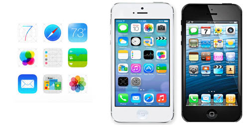
The graphic above shows three versions of Apple iOS icons. The image on the right, in the black iPhone, shows the icons as they appear in the current version of the OS, iOS 6. The white iPhone in the middle shows those same icons, rendered in the new iOS 7 style that was debuted at the World Wide Developer Conference (WWDC) in San Francisco earlier this week. The 9 icons on the left appeared today on Apple’s mobile website, and it is clear that at least three of them have changed since the iOS 7 announcement.
It looks as if Apple is responding to feedback, that has been swift and fierce, about the new icons. Many online felt that they were too colorful, and bordered on cartoonish. Icons for the Calendar app, Weather app, and Passbook app have all appear to have been modified since iOS 7 was announced. (See detail of before/after below)
![]()
At this time, it is not clear which icons are the ones likely to appear in the final version of the operating system, due out this fall. Apple seems to be continuing to tweak its designs, and may be doing so in reaction to customer feedback.
Of course Apple is still tweaking. This is beta.